As businesses whether big or small, we are all concerned about our customers and potential leads because they are the major contributor to the business growth. We are well versed with the fact that digital transformation has penetrated businesses also and people are using digital platforms to promote their product and services.
Optimizing your website in such a way which will help you to get more leads that everybody is running for because everybody needs more customers. For the same the one important factor which any business website must have is Call-to-action.
What is Call-to-action?
Call to action is the messages or text which is in meant to be on the website so that users/customers will be indented to take action.
Types of call to action buttons –
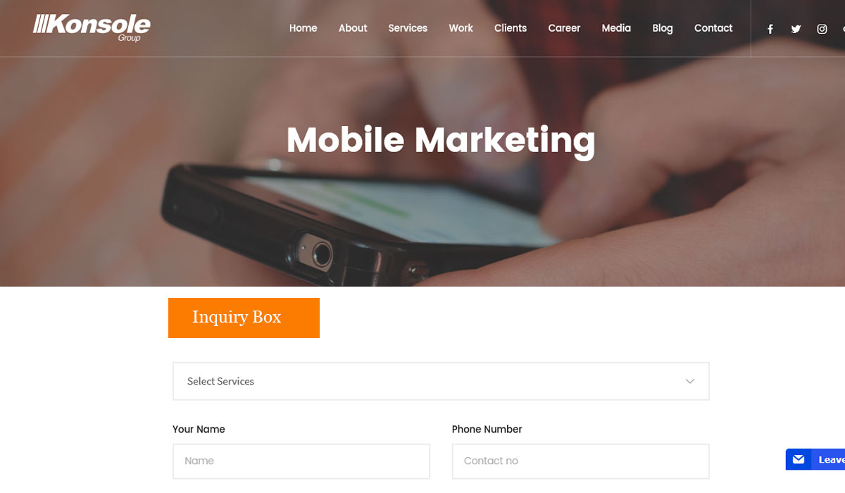
1. Enquire now / Call us
Earning leads is the main target of CTAs. The placement of CTA buttons should be in the right order which is also eye catchy because we aim to turn visitors into customers. The CTA should hold a place on the website which is visible to uses like in sidebars or the end of the page. Example- calls us, enquire now, and get in touch.
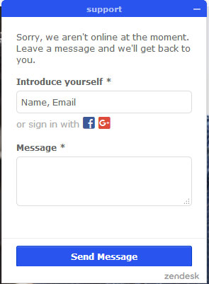
 2. Chat Box
This part of the website used a solution for businesses to communicate with the visitors who are interested to know about your business. This is the best way as it is in real time interaction with your potential audience.

3. Read more button
When you want your website users to read an article, blog etc and you don’t want to display full content then you use “Read More” button. It builds user engagement and shows that the user is interested in your content.

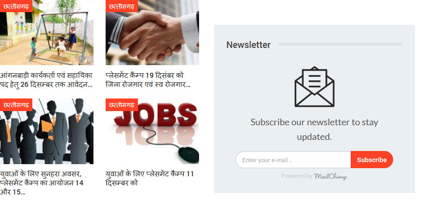
4. Subscription form
You can use a CTA for letting users fill the form for so you can get the access to the database of your potential customers. Using their information you can send those messages or emails regarding the latest updates related to the product and services.

5. Social sharing
This one is an indirect strategy but a good option. Giving users the idea of sharing your content or other information socially will be beneficial because an identity will be created and user engagement can be built. But it makes sense only in certain situations otherwise the users might get distracted.

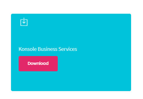
6. Download button
You can give options to your users to download the brochures, ppt or any other informative document through “Download” button. You can get user details through this CTA which builds your database for future plans.

How to use CTA to increase leads for your business?
1. Consider the customer’s point of view
We need to focus on both the sides of the coin wherein the requirements of both the business and the users should be fulfilled. Users are looking for the answers which can be resolved through CTA very smartly. Before expecting people to respond we need to identify and also communicate the benefits of responding.
2. Positioning of the CTA button
Yes, placement is very crucial part in the page of the website because it should draw user’s attention at the right time during its visit. Adjustments can vary from business to business but it is usually seen in the corner or the end. One thing to be kept in mind that, it should not be at those places which disturb the interaction of users and irritates him which in turn can increase bounce rate. In a nutshell, you should know at what point the users should respond
3. Look and feel
The color of the CTA does matters which depend on the design of the website. Usually, contrasting colors are used to highlight CTAs so it can stand out and not gets indulged with the other text or background. It should be pleasing as well as appealing. The size does also matter because you cannot have huge CTA button just to get leads. It should not surpass the other elements of the website.
4. Make it communicative
The button should communicate the intent to the users because there are various types of CTAs. This is crucial to increase the probability of getting a click.
5. Correct landing page
Every CTA should have a proper landing page for further assistance for visitors. It is the best practice in order to help users to navigate through the transaction process or maybe for the lead generation journey. If done right, this will definitely show results. For example, you can get your users to land on a Thank you page after completing a transaction.
6. CTA on every page
The number of CTA will vary from site to site but is recommended because if the users reach a dead end and will leave without responding then it will not be fruitful for business because that one user could be a potential customer also. For every business, the need to put a specific CTA will be different according to their requirements. For example, you can have chat boxes in relevant pages to interact with your visitors and guide them through their journey on the website.
7. Follow through
Always remember to follow through the call to action process after the user has clicked. This process does not end it here in certain situations. For this you can use signing up for mail subscriptions, filling of enquiry form etc. The activities should be streamlining in order to avoid bounce rates.
Call to actions is optimized and recognized by the experienced website designing company and the same is implemented in the best way to build a relationship with your users. That is why is not just for the conversion or lead generation but also the perception and mindset.
If you have any query, mail us at – [email protected]


