What is Landing Page ?
Landing page is a web page that allows you to capture leads from page visitors.
A landing page is a separate webpage that a viewer views after clicking an ad (pay-per-click, facebook ads, google display banner ads, etc.
A landing page is commonly used in marketing campaigns because landing page concentrate on a single offer or ideas to attract visitors to complete pre-defined objective.

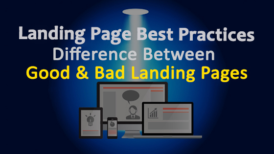
Landing Page Best Practices- Difference between Good or Bad Landing Pages
Good Landing Page :
Below are the few points to improve quality of your landing Page:
1. Clear Call to Action :
The call to action button is a simple way to communicate directly with visitors and motivate them to take an immediate action (like: as buy, contact, register etc.) after visiting the landing page. The call to action button should be unique, it should show on the top of the page and it should connect a clear message to visitors.
2. Make Your Design Clean & Simple :
Client may get confuse by loose graphics, more written text, number of detailed sentences. Leave plenty of white space on your web page. Make your font styles easily readable, add interesting video clips with bullet points.
3. Unique Selling Proposition :
A. Main Heading :
Main heading is the very first thing that people will see and read out. It should highlight your unique selling proposition.
B. Sub Heading :
Sub-Heading should brief about the USP (Unique Selling Proposition) you discussed in your heading.
4. Bullet point list summary of Benefits/offers :
Instead of writing paragraphs, provide the details in bullet points. It will be easy to understand and remember for the readers.
5. Very Important Attributes(VIA) :
Visitors generally scan your landing page to get quick details; mention the most important details about your products or services that you think are the most important to display.
6. Social Proof :
Feedbacks of customer are of utmost importance. Positive feedbacks creates magic for potential customers. An ideal landing page should consist of testimonials, past work, appreciation etc.
7. Mobile Friendly :
Landing pages should be quickly navigable even on mobile devices. When visitors search for landing pages with mobile phones they only want to scan important informations so the details should be present precisely.
Bad landing Page :
These are the few points that can destroy you landing page experience:
1. Too Much Text :
Landing pages with too much texts can confuse customers. Landing pages should be attractive and within thousand words.
2. Bad Call to Action :
Call to action button is important in every landing pages; it should focus on your landing page objective like shopping, signing up, registration etc.
An unclear Call-to-action in unattractive color will decrease your conversions. Always align your the Call-to-action text with your landing page objective and make them of contrasting colors so that they attract visitors’ attention.
3. No Trust Symbol or Customer Testimonials :
Trust signs and client recommendations can build trust to visitors who don’t trust your brand.
When you use Facebook ads or display Ads, gathering traffic from social sites, you are speaking with a prospect who likes social supports – give them the power of client testimonials.
4. Entry Form is complicated or too long :
Complicated and too long entry forms can irritate customers. Keep entry forms short to only ask necessary details that will be easy for customers to fulfill.
5. The Headers don’t match the call to action :
A bad landing page is unable to explain relation of call-to-action button and headline. The wording and terminology doesn’t have to suit exactly, but ensure that headers are clearly related to the call-to-action button.
6. No unique selling proposition :
Headings, sub-headings, benefits, strengthening and conclusion on landing page indicates USP . Social proof is used to back up USP. We don’t have to use all of the above elements for landing page, but it should discuss the main USP your business possess.
7. No clear list of Benefits or offers :
Offers give visitors reason to take immediate action with an offer on landing page you can induce your prospect to take immediate action and convert into a lead.


Nice article